ReadyForZero
My Role: Sr. UX Designer
Industry: Fintech
Current State: Delivred
Spring 2015-Spring 2016
ReadyForZero, Avant
User Experience Design, Software Design
ReadyForZero (RFZ) provides online, personal financial management tools and software for paying off debt. I joined the ReadyForZero team in June 2015 and served as the UX designer and worked on its personal finance product ecosystem for almost 7 months. Over that period, by working and collaborating closely with the product team (developers and product managers), I learned about financial products, and more importantly, I was able to pursue my passion for data-driven design and utilized my user experience design skills.
Credit Score Tracking
Credit score tracking is one of the features that ReadyForZero added to the product, and our team released it on October 2015. The feature aims to educate users about their financial profile and improve their experience with RFZ products. As the user experience designer of the team, I led the entire design process of this feature which ultimately was designed and developed by our product team (designers, developers, and product manager) and launched with minimum bugs or issues.
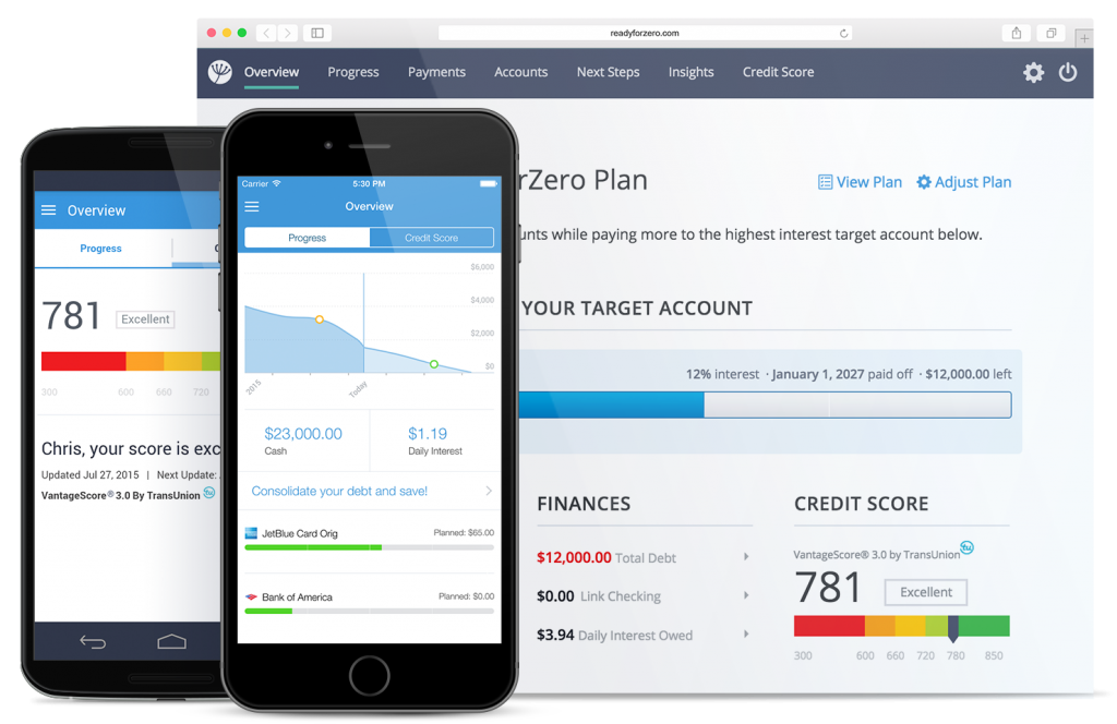
My goal as a user experience designer was to design a seamless and compelling product so that our users could receive the information and education they need frequently and improve their financial literacy. Adding this feature had some implications for the existing product, and part of my job was to make sure that this feature was integrated into the product ecosystem.
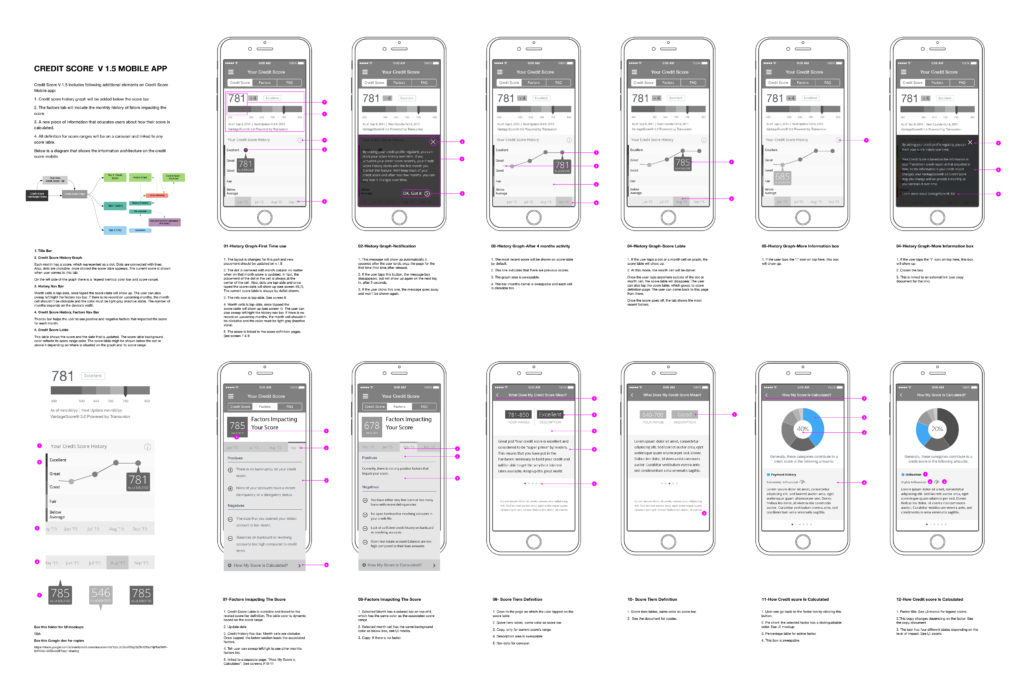
Credit Score Tracking, Annotated Wireframes
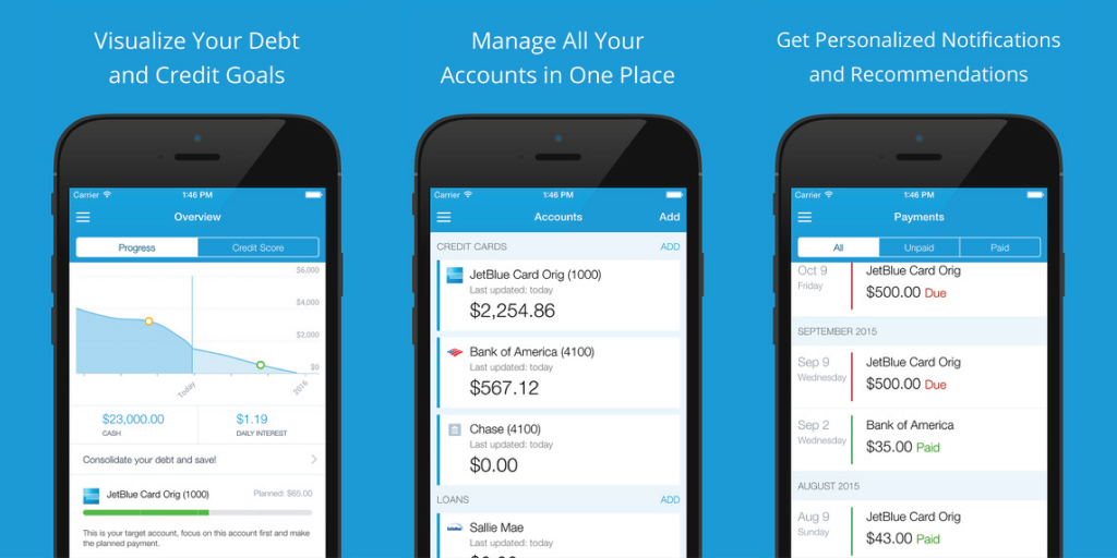
Credit score tracking is designed for both web applications and mobile apps. To accomplish this, both platforms’ information architecture and interaction were updated to accommodate this feature. In addition, to create the application flow, result page, and emails (triggered and marketing emails), our design team collaborated with software developers, other designers, and product managers. After launching the product, I optimized the funnel based on the A/B test and usability test results. Apart from the above project, redesigning the entire RFZ’s triggered and marketing emails, including emails related to credit score tracking, was another task that I accomplished.
Credit Score Tracking, Triggered and Marketing Emails Spreadsheet
Onboarding Flow
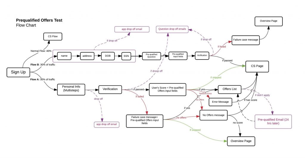
We identified some pain points in our signup flow through data tracking and usability tests. Therefore we brainstormed several solutions and designed another alternative based on which we consolidated the signup flow with the credit score application. We also decided to A/B test these two scenarios and determine which performs better. Therefore, our team designed a new flow and listed all the use and drop-off cases. In addition, I designed new emails for the latest signup flow and ensured there would be no conflict with the original flow. Since the whole product was designed based on the original flow, an important part of our task was considering the implications of new changes on our users’ experience while signing up and using the dashboard. Fortunately, we could foresee all of the use cases and scenarios and run a successful test. After running the A/B test for two months and analyzing our data, we noticed that the new signup flow performs better, and our conversion rate has been improved by 16%.
Signup Flow Diagram, A/B testing two different flows
User Experience Research
RFZ has a user-centered approach to the design and development of financial products. The design team, in particular, was formed based on a human-centered approach and agile philosophy; therefore, we tried to design our products based on compelling evidence that we gathered through qualitative and quantitative research. As a result, part of my job at RFZ was to conduct or participate in user experience research and understand the real needs of our users.
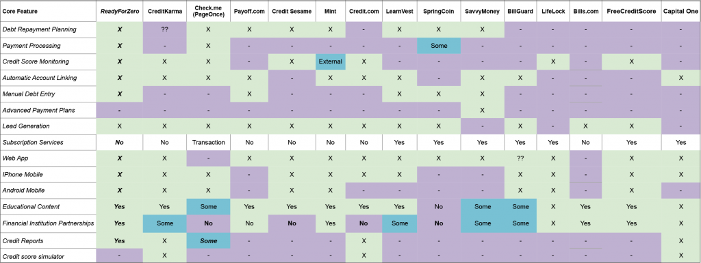
Competitive Analysis Spreadsheet
For this purpose, I worked closely with our user experience researcher and two other designers to conduct UX research. I gathered user data to identify pain points/problems, understand users’ behaviors, and collect reliable evidence for our design decisions. For this purpose, we used the following qualitative and quantitative methods:
- Personas
- Competitive analysis
- UX audit and reviewing the status quo
- Analyzing user behavior data (we used tracking tools such as Google Analytics, Looker, and Hotjar)
- Reviewing user inquiries or feedback on Help Scout
- Usability tests
- User Interviews
- Surveys
- Brainstorms sessions
- A/B testing
- Mental Model diagram
- Flow diagrams


In addition to the above-mentioned projects, I worked on the following tasks, features, or projects at RFZ based on our qualitative and quantitative research.
- Redesigned the information architecture for both web applications and mobile apps.
- Redesigned all triggered and marketing emails.
- Improved social media integration for the RFZ blog.
- Redesigned and optimized debt consolidation landing pages and application funnel.
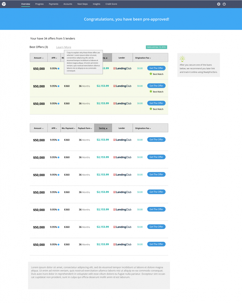
- Redesigned and optimized debt consolidation loan offer result page.
- Designed pre-qualified loan offer applications and ran A/B tests for two different designs.
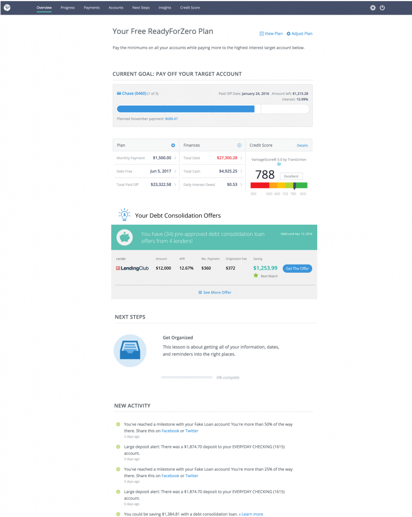
- Designed tailored financial products on the dashboard based on users’ financial profiles.
- Designed the user experience and interaction for product reviews.
